Job Titles Distribution by Gender and Salary

What are the top 10 Job Titles and how are they distributed?
Plot Analysis
Introduction
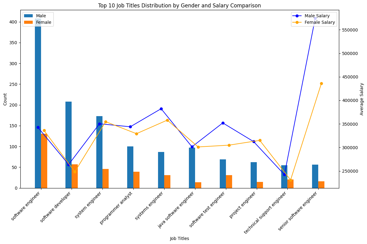
This visualization examines the gender distribution and average salaries across the top 10 job titles. It provides insights into gender representation and salary discrepancies within the workforce.
Bar Chart
The bar chart displays the count of male and female individuals in each job title. It visually compares gender distribution across roles, highlighting any disparities.
Line Plot
A line plot overlays the average salary for each job title. Blue markers represent male average salaries, while orange markers represent female average salaries. This allows for easy comparison of salary differences between genders.
Insights and Implications
By combining bar and line plots, the visualization presents gender distribution and salary differentials effectively. Insights gained can inform discussions on promoting gender equity and addressing pay disparities.
Conclusion
This visualization offers valuable insights into gender representation and salary gaps. Stakeholders can use these insights to take informed action towards fostering equality and inclusivity in the workplace.